Community Science Museum
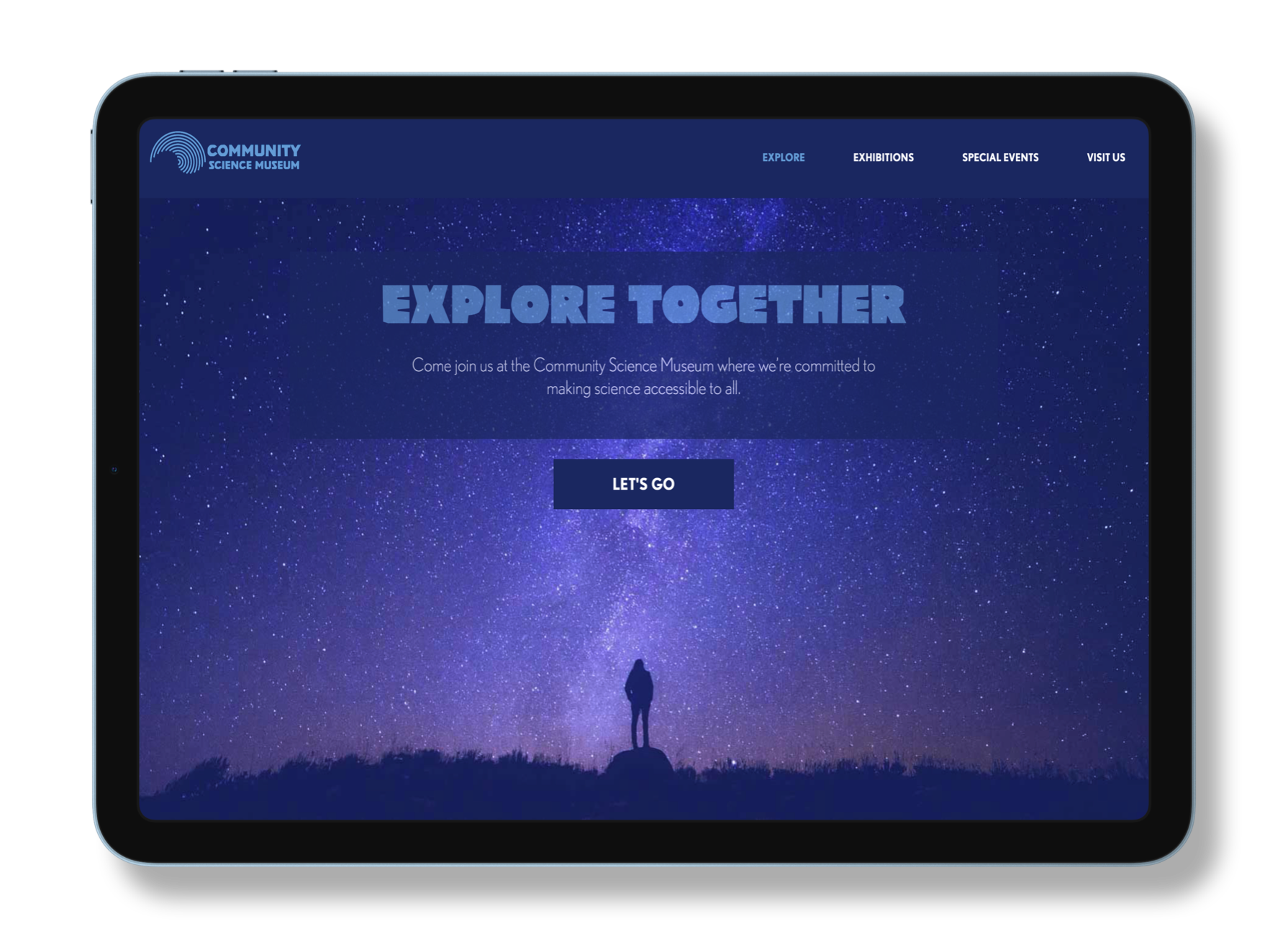
An interactive exhibition centre called Community Science Museum is opening in the ficticious city of Oslotlantis. Developing a website for this immaginary museum was my first project as a frontend development student at the Norwegian School of Technology and Digital Media (Noroff). It's just HTML and CSS, plus a healthy dose of UX/UI principles.
Product
Design concept
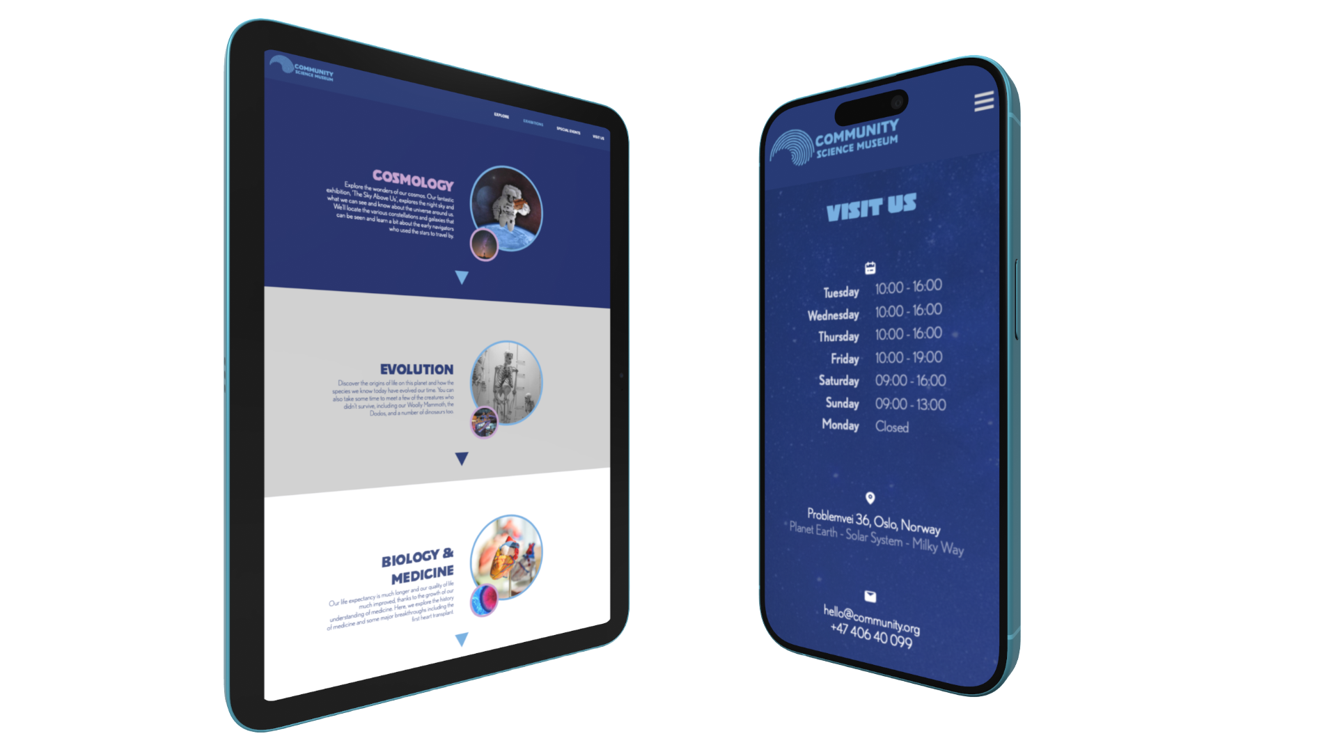
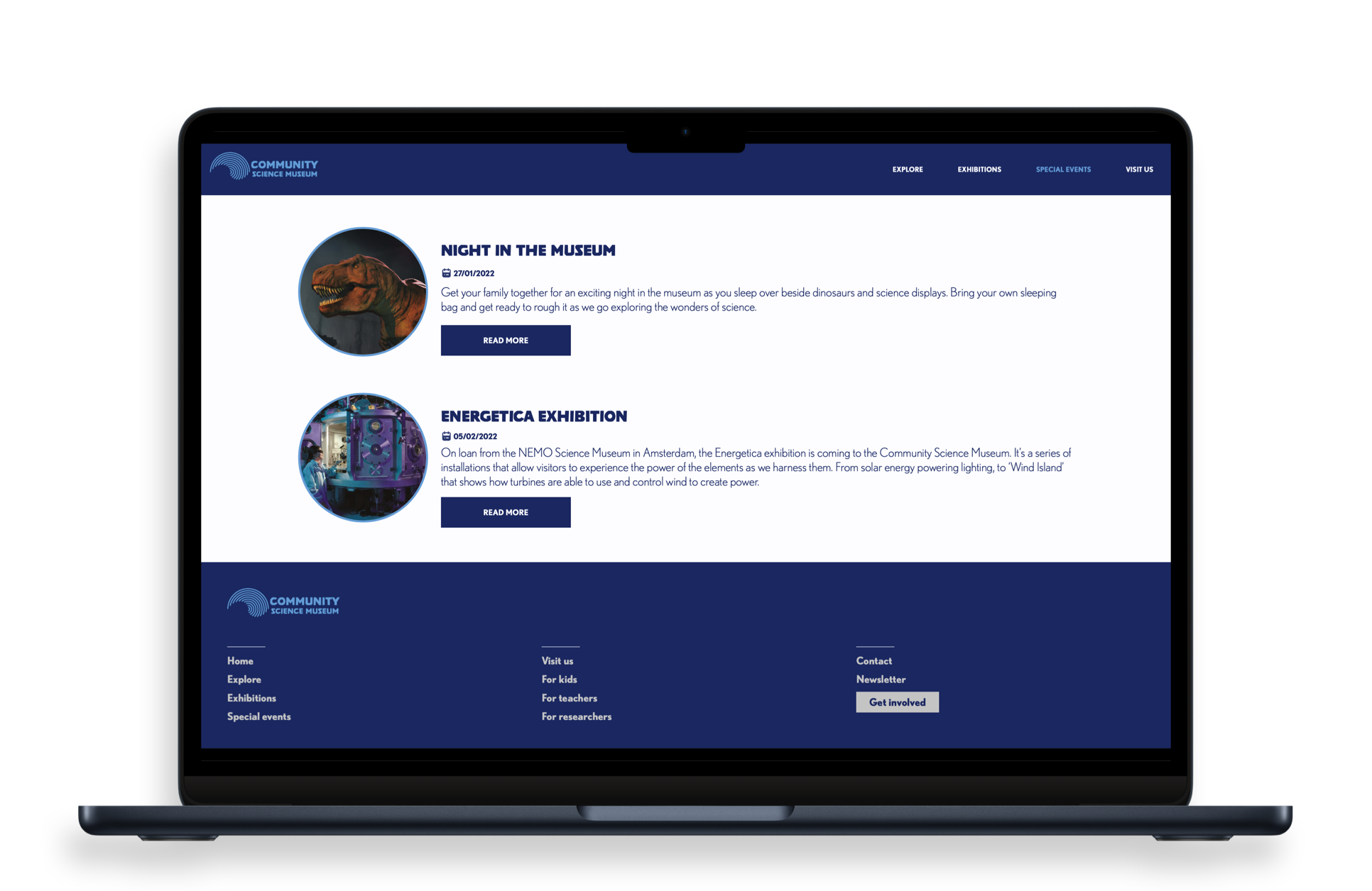
Playful rather than serious. Simple rather than complex. These were the basic premises that guided me in the conceptualisation of the Community Science Museum website. From the colour palette to the typographic choices, from the selection of the images to the navigation structure of the project, the choices that I have made reflect a well-defined goal: develop something that is functionally simple and aesthetically appealing to young target audiences:
- "Primary and middle school children (7-15) and families with young children".
- The site should appeal to youngsters without pandering;
- It should take for granted that the audience is inquisitive and intelligent;
- The website should be responsive and be easy to use on a variety of devices.
Colour study
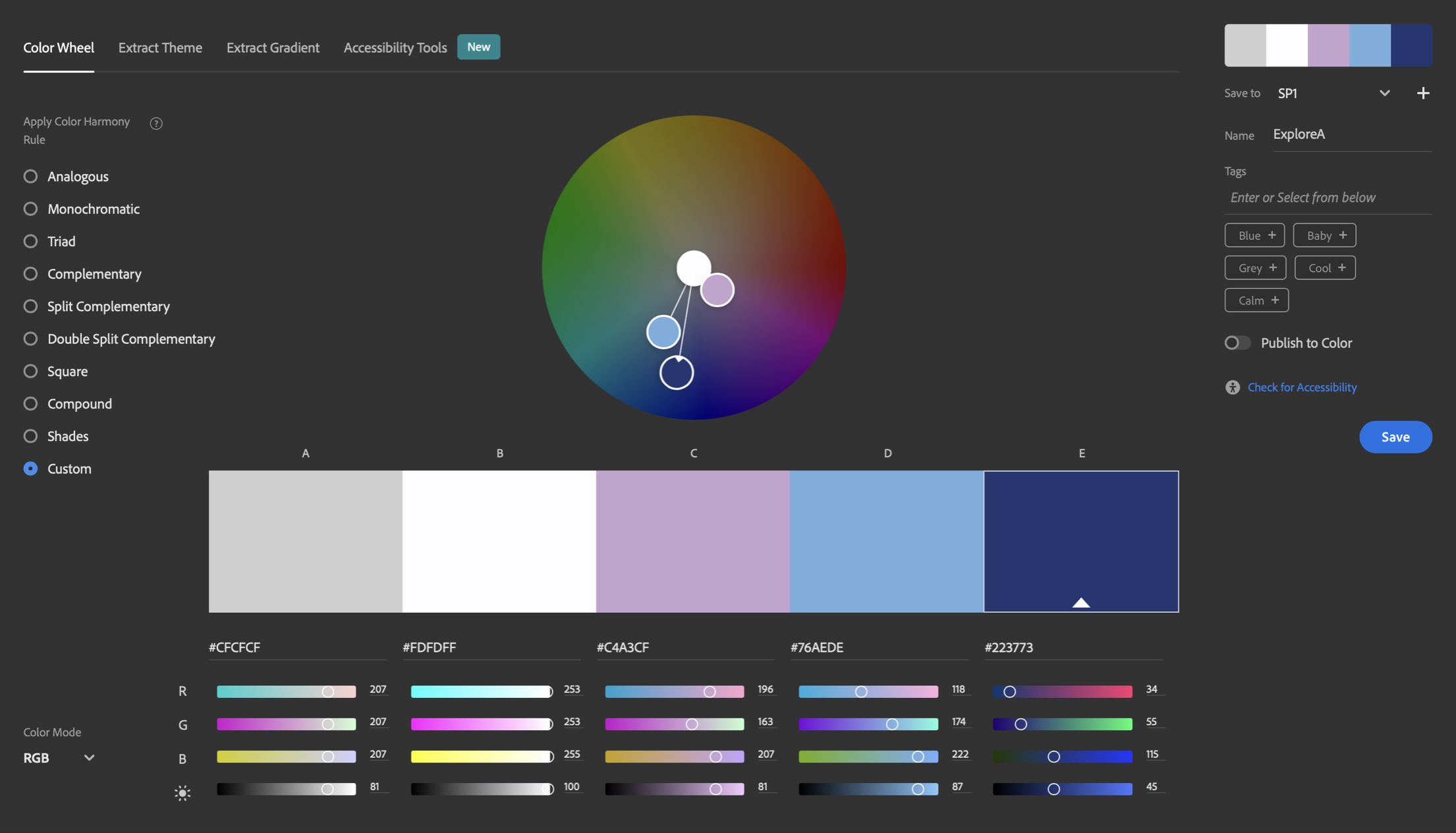
Never underestimate how tricky it can be to design an accessible colour palette! One of the tools I often find myself using is Adobe Colour. Inspiring the visual identity of a project on a picture or painting is not an uncommon approach. This how I usually start:
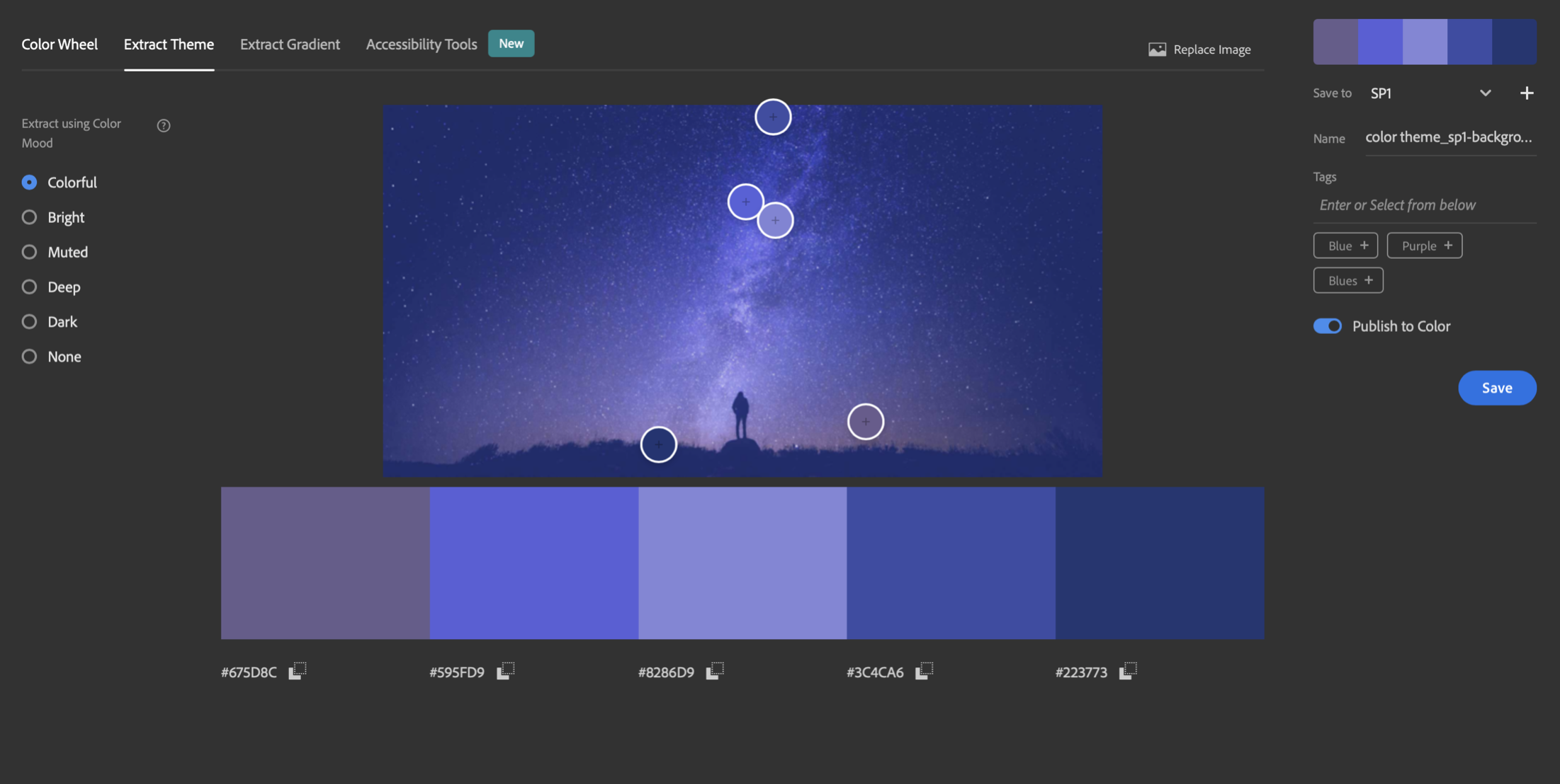
Then, all we have to do is gently adjust the desired hues and make sure they follow rigorous accessibility standards:
Proportions
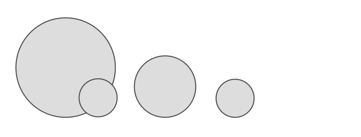
A lot of experienced developers overlook what I consider a rather powerful design principle: the use of the Fibonacci sequence and the "golden ratio". This is how I achieved a harmonious proportion between the many images that illustrate this project.
Their diameter, starting from 400px, evolves following a ratio of 0.618. For example:
400 * 0.618 = 247247 * 0.618 ≈ 153
Tools
- Adobe XD
- Adobe Color
- HTML
- CSS
Code snippet
Those numbers (400, 247, 300, 153) may seem random. As I said before, though, they have been carefully calculated!
/* IMAGES */
.img-big {
  width: 400px;
  height: 400px;
  object-fit: cover;
  border-radius: 50%;
  border: solid 10px var(--blue);
}

.img-small {
  width: 153px;
  height: 153px;
  object-fit: cover;
  border-radius: 50%;
  border: solid 10px var(--pink);
  position: relative;
  top: -100px;
}

.img-content2 {
  object-fit: cover;
  width: 300px;
  height: 300px;
  border-radius: 50%;
  border: solid 5px var(--blue);
}

.img-content3 {
  width: 247px;
  height: 247px;
  object-fit: cover;
  border-radius: 50%;
  border: solid 10px var(--blue);
}